What is accessible design
Accessibility is not a one-way path to an ugly or dull website. It's a set of guidelines that should not be considered as 'constraints', but rather opportunities to explore new ideas with the end goal of creating better, more inclusive, websites for everyone.
There are three main aspects of accessible design:
-
Visual accessibility is about making sure that all content is accessible to people with low vision or blindness.
-
Auditory accessibility refers to making sure that all audio content is accessible to people who are deaf or hard of hearing.
-
Motor accessibility is making sure all interactions with a website are accessible to people with mobility impairments.
The main driving-force behind accessibility design is the 'Web Content Accessibility Guidelines (WCAG)' whose main goal is to provide a single shared standard for web content accessibility.
Why is it important?
Everyone benefits: According to the World Health Organisation, at least 2.2 billion people have some form of visual impairment. However, they aren't the only consideration. When we cater for the visually impaired, we're making the website easy to read and navigate for everyone, across every device.
With great power, comes great responsibility: Ok, so we're not comparing ourselves to superheroes, but if we have the option to do good in the world, we should take it. Putting it simply, we care about the visitors of our websites, and so should you.

Cover yourself: Accessibility-related lawsuits are said to be on the rise. Following existing accessibility guidelines could reduce your companies future liability.
How we design for accessibility
Now that we've covered what accessible design is, and why it is important, how do we approach design?
The best way to start is by considering the needs of all users from the beginning of each project. After we've established that, we can start to think about how best to present the content and how to make interactions accessible. The devil really is in the detail, with content, contrast, colours, styles and code all needing to be carefully considered.
Let's discuss some of the most important (and sometimes overlooked) aspects of designing for accessibility.
Content first
Every line of copy must be clear and easy to understand. This means using correct language, avoiding jargon or slang, and using descriptive text for links. For example: Use phrases such as "Find out more about designing for accessibility" rather than "Find out more" when linking to content.
Descriptive labels also help your search engine optimisation (SEO), so there's really no reason not to.
Text legibility
It almost goes without saying, but all informative text must be legible. This generally boils down to 3 things:
-
Is the text large enough? We ensure all text meets the WCAG minimum size requirements.
-
Is there enough contrast between the colours? When designing we use tools to analyse the contrast of each colour combination.
-
Is the font (typeface) suitable? Some fonts are intended to be decorative only, so are not suitable to convey information.
If the answer to all of these questions is 'yes' - we're good to go.
Interactions
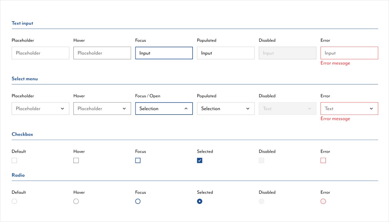
The intent of interactive elements (buttons, form inputs, links) should be immediately obvious. For example, buttons should be styled as such, and form inputs should have clear labels.
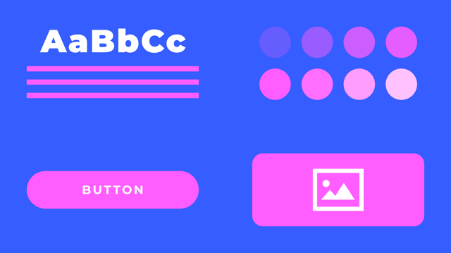
We mockup a design style guide for every project, documenting the styling when an element is hovered, focused, disabled, and more.
We often expand these style guides into fully-fledged design systems in Figma. Creating a consistent user experience for every page. To find out how you can benefit from implementing a design system for your website, contact us.
Layout
A website's layout can have a huge impact on its overall accessibility. We always use grid systems as the foundation of our layouts, as they are inherently accessible and easy to use with assistive technologies.
We all see the world differently
According to Colour Blind Awareness, approximately 1 in 12 men (8%) and 1 in 200 women over the world are affected by colour blindness. What does this mean in practice?
Basically, colours should never be used as the only way to convey information. For example, let's say we are designing a task management application, using the colour 'green' to mark tasks as complete, and 'red' to flag tasks as urgent. Sounds clear enough, right? Now let's consider a user suffers from protanopia or deuteranopia, meaning they can't tell the difference between red or green. How will they know the difference if we rely on colour to distinguish between both?
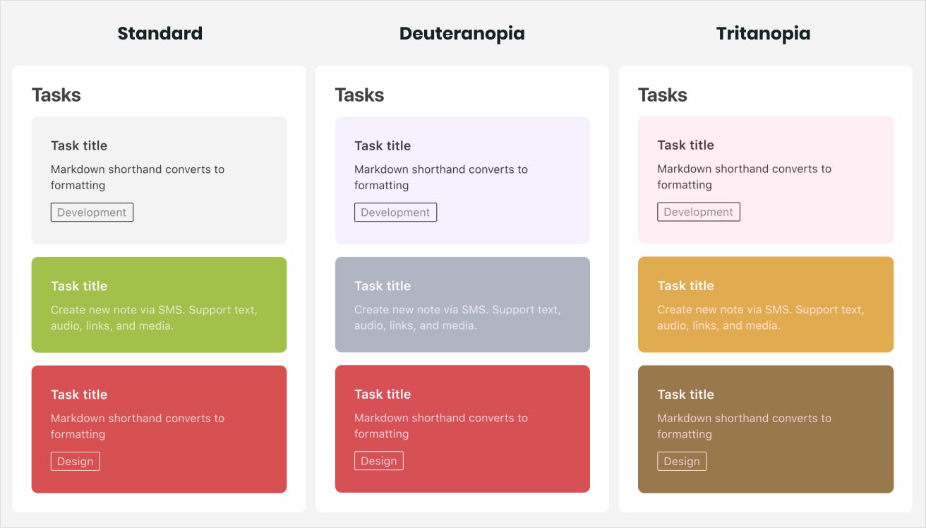
During the design process, we utilise applications and plugins for our design software (Figma) to simulate what the page looks like to different colour blindness types (such as Sim Daltonism Colour Blindness Simulator, and Color Blind Figma Plugin). This helps us ensure call-to-actions are still clear, text is legible, and elements of the UI are distinguishable.
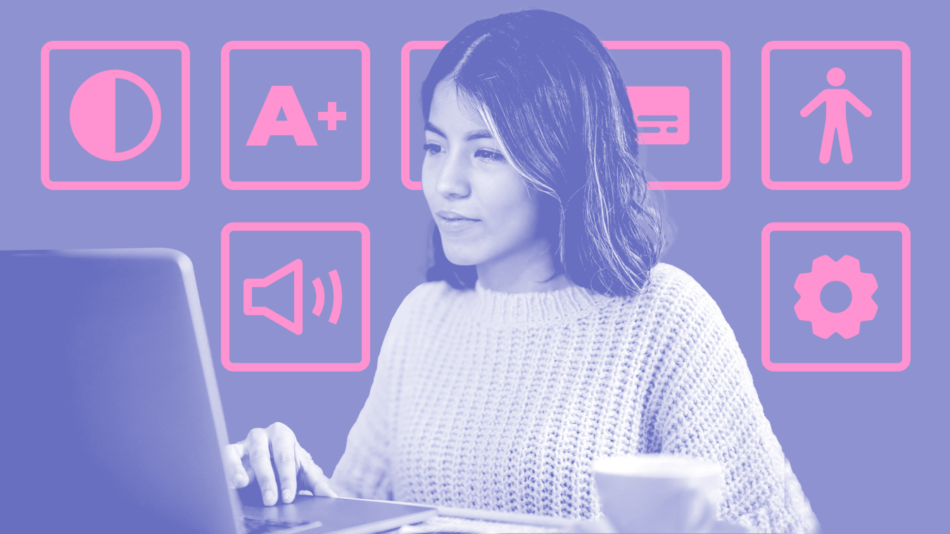
Accessibility widgets
An embedded accessibility widget allows individual users to customise their browsing experience to the most comfortable configuration for them – offering options to increase text-size, enable high contrast mode, adjust text alignment, and much more.
See and hear everything
Both audio and video should be accessible so that everyone has the same experience, regardless of their ability.
- For audio content: it's important to always include subtitles or transcripts for your video where possible.
- For video content: make sure the volume is not muted by default. Also, consider including captions for your videos which can be turned on or off at will. Captions provide a visual representation of all audio within the video (so users who are playing back in silent mode can see what's being said).
Code
To write accessible code, we always refer to the Web Content Accessibility Guidelines (WCAG). There are a lot of tools which help us achieve accessible code, such as Wave, Tenon, Google Lighthouse and Axe. These tools help us locate elements which haven't been made accessible, and provide recommendations based on what the WCAG advises.
Our developers always strive to be at the cutting-edge of web accessibility.

How we can help
We've briefly covered our contribution to make the web a more accessible place for everyone, whilst boosting user engagement. In truth, we could have written an entire article on each of these processes. Another day we will cover design accessibility for data visualisations, and explain in-depth our process for choosing accessible colour styles.
Want to know where you are losing visitors on your site due to poor accessibility? Have a project that you want to discuss? Get in touch - we're here to help.